The accompanying Python Notebook for this blog post can be found here on Google Colab, opens in a new tab.
The Open SGID
The introduction of the Open SGID, opens in a new tab has opened the door for new ways to explore Utah’s GIS data. Before the Open SGID, a user would typically have gone to the UGRC web page to find the data they were looking for and download it in shapefile or file geodatabase format. This can still be done today, but now that UGRC has leveraged the SGID on ArcGIS, opens in a new tab platform, there are more options for users to access geospatial data in their preferred way. Data can now be streamed to clients via web services or can be downloaded in even more formats (e.g., GeoJSON, KML, and CSV). But the recently launched Open SGID is an especially valuable resource because it is a cloud-hosted PostgreSQL PostGIS database that anyone can connect to. As the Open SGID has nightly automated updates, tapping into the Open SGID means you’ll have a living connection to the freshest SGID data available.
The Open SGID also creates an opportunity for users to pull in data and perform analysis using open source software and libraries-like Python. With this route, you don’t need to worry about paying for licensed software or even installing GIS desktop software at all. And if you use a cloud-hosted Jupyter notebook—like Google Colab—you don’t even have to install Python on your computer (or tablet or chromebook)!
Python Notebook and Libraries
The rest of this article will walk you through a brief tutorial of how easy it can be to pull SGID data into Python to perform analysis or create simple maps. These basic building blocks, combined with a little gumption and googling, can put you well on your way to performing whatever analysis you desire. A link to the Jupyter notebook in Google Colab is also included, so you can run the code yourself and build upon it.
- Psycopg2, opens in a new tab - A PostgreSQL/PostGIS client for Python
- GeoPandas, opens in a new tab - An open source Python project for working with geospatial data
- Extends the popular Pandas, opens in a new tab library to geospatial data
- Matplotlib, opens in a new tab - A plotting and visualization library for Python
(Note: some of the querying and filtering in these examples can be done entirely in SQL, but GeoPandas is used to demonstrate its capabilities)
Install and Import Needed Python Libraries
In the first couple of cells, install the Python libraries that aren’t preinstalled (i.e., GeoPandas and psycopg2) and then import the needed libraries so they can be used in the script (i.e., GeoPandas, matplotlib, psycopg2).
# Install the libraries you'll need
pip install geopandas
pip install psycopg2-binary
# Import the libraries
import geopandas as gpd
import matplotlib.pyplot as plt
import psycopg2EXAMPLE 1: County Boundaries in Utah
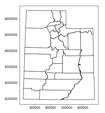
Let’s start with a very simple example where you’ll pull county boundaries from the Open SGID using the psycopg2 database client for Postgres and plot them with a basic map.
- Create a connection object that will hold the necessary arguments for the Postgres connection (i.e., database, user, password, and host).
- Build a SQL query that will be used to specify the data layer you want to retrieve.
- Use a GeoPandas method to read data from PostGIS, supplying it with your SQL query, connection information, and the field you will be using as the geometry column—this is always the shape field for the Open SGID.
- Finally, now that the spatial data is loaded in memory, create a simple plot of it with the GeoPandas
.plot()method, which uses matplotlib behind the scenes.
# Postgres database connection information
con = psycopg2.connect(database="opensgid", user="agrc", password="agrc",
    host="opensgid.agrc.utah.gov")

# Simple query to grab and plot Utah counties
sql = "select * from opensgid.boundaries.county_boundaries"
counties = gpd.GeoDataFrame.from_postgis(sql, con, geom_col='shape')

counties.plot(figsize=(10, 6), color='white', edgecolor='black')
EXAMPLE 2: Davis County Address Points by Zip Code
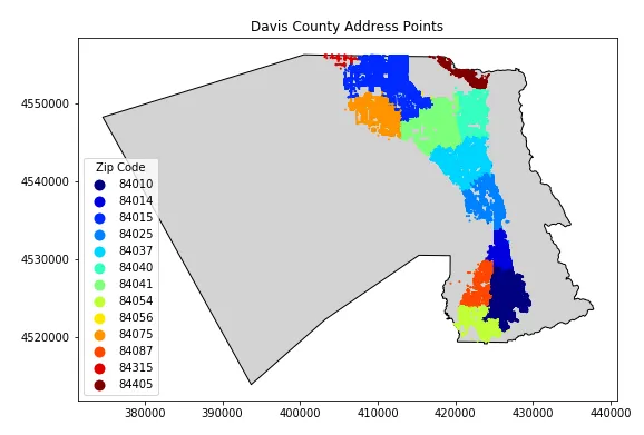
For the second example, you’ll do something a little more colorful by plotting Davis County address points, colored by zip code.
- Start by creating two data layers: one for the address points within Davis County and one for the Davis County boundary. To do this, expand the SQL queries by adding “where clauses” to filter the address points down to just those in Davis County (
countyid = '49011') and select just Davis County’s boundary (name = 'DAVIS'). - The plot gets a little more complex, too, as you begin to customize the appearance a little more. To do this, create figure and axis objects that can provide more control over the plot’s appearance using matplotlib.
- Then, add each layer to the plot, specifying the axis that you want to use, as well as different color and size properties. For the address points, plot the colors based on the zip code (
column='zipcode'), assign a colormap (cmap='jet'), and add a legend by specifying the title and location. - Finally, you can add a title to the plot (
plt.title('Davis County Address Points')) and display it withplt.show().
The GeoPandas, opens in a new tab and Matplotlib, opens in a new tab web pages both provide documentation on how to customize plots.
# Davis County address points by zip code
sql_addpts = "select * from opensgid.location.address_points where countyid = '49011'"
addpts = gpd.GeoDataFrame.from_postgis(sql_addpts, con, geom_col='shape')

sql_davis = "select * from opensgid.boundaries.county_boundaries where name = 'DAVIS'"
davis = gpd.GeoDataFrame.from_postgis(sql_davis, con, geom_col='shape')

# Plot address points symbolized by zip code
fig, ax = plt.subplots(figsize=(10, 6))
davis.plot(ax=ax, color='lightgray', edgecolor='black')
addpts.plot(ax=ax, column='zipcode', cmap='jet', markersize=1, legend=True,
            legend_kwds={'title': 'Zip Code',
                         'loc': 'lower left'})
plt.title('Davis County Address Points')
plt.show()
EXAMPLE 3: Utah Faults Longer than One Mile
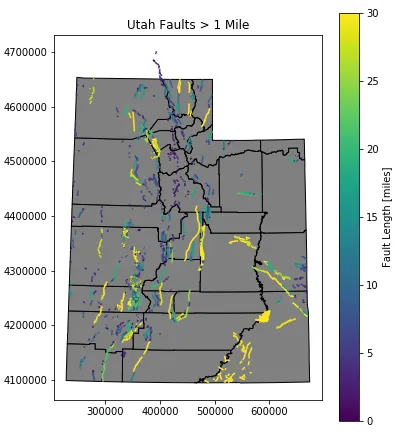
This third example demonstrates the subsetting capabilities of Pandas/GeoPandas to find and plot fault lines in Utah that are longer than 1 mile (1609.34 meters). The native unit of Open SGID data is meters, so calculations and queries are performed in meters. After performing the query, a conversion to miles is done to demonstrate how to add a field in GeoPandas and to improve human interpretation of the threshold used.
- First, specify the layer you want to work with in the SQL query.
- Second, create a subset of all the faults (called long_faults) by selecting those where the shape field has a length greater than 1609.34 meters. Use
.copy()at the end of this line of code to prevent a “chained assignment” warning in Pandas. - Next, calculate a new field in this subset that converts the length into miles.
- Finally, plot the counties and faults longer than 1 mile, colored by length. Note that the syntax for the legend is a little different now that you are plotting a continuous variable (the length field is formatted as a floating point number) rather than a discrete variable (the zipcode field is formatted as a string). You can also specify the starting and ending ranges for the colorbar (
vminandvmax).
# Utah faults longer than 1 mile
sql_faults = "select * from opensgid.geoscience.quaternary_faults"
faults = gpd.GeoDataFrame.from_postgis(sql_faults, con, geom_col='shape')

# Filter down to faults longer than 1 mile, create 'length_mi' column
long_faults = faults[faults['shape'].length > 1609.34].copy()
long_faults['length_mi'] = long_faults['shape'].length/1609.34

# Plot faults symbolized by length of the fault
fig, ax = plt.subplots(figsize=(6, 10))
counties.plot(ax=ax, color='gray', edgecolor='black')
long_faults.plot(ax=ax, column='length_mi', cmap='viridis', vmin=0, vmax=30, legend=True,
                 legend_kwds={'label': 'Fault Length [miles]', 'shrink': 0.75})
plt.title('Utah Faults > 1 Mile')
plt.show()
EXAMPLE 4: Libraries in State Senate District 24
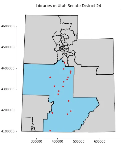
For this fourth example, you’ll plot public libraries within State Senate District 24 by using a spatial operation, which is really where GeoPandas shines and sets itself apart from non-spatial tools.
- Start by selecting the data layers (hopefully the syntax is getting familiar now) with SQL queries and importing them with GeoPandas.
- Next, subset the senate districts down to just district 24 using Pandas square bracket
[]notation. - Then, subset the libraries data set by selecting the libraries (and their geometry) that are within district 24.
- Finally, plot all districts, the selected district (24), and all libraries that fall within the selected district.
# Utah Libraries in Senate District 24
sql_sen = "select * from opensgid.political.senate_districts_2012"
sen_districts = gpd.GeoDataFrame.from_postgis(sql_sen, con, geom_col='shape')

sql_lib = "select * from opensgid.society.libraries"
libraries = gpd.GeoDataFrame.from_postgis(sql_lib, con, geom_col='shape')

# Filter down to district 24 and select libraries within the district
dist_24 = sen_districts.loc[sen_districts['dist'] == 24]
lib_24 = libraries[libraries.within(dist_24.unary_union)]

# Plot senate districts and libraries
fig, ax = plt.subplots(figsize=(6, 10))
sen_districts.plot(ax=ax, color='lightgray', edgecolor='black')
dist_24.plot(ax=ax, color='skyblue', edgecolor='black')
lib_24.plot(ax=ax, color='red', markersize=10)
plt.title('Libraries in Utah Senate District 24')
plt.show()
That’s it! This brief tutorial has shown a few different ways to gather and analyze data from the Open SGID with the psycopg2 and GeoPandas libraries. Hopefully it was helpful and will spark your interest in both the Open SGID and using open source Python tools.
_[UGRC]: Utah Geospatial Resource Center _[SGID]: State Geographic Information Database