You’ve probably heard the saying, there are many ways to peel an orange. Similarly, you’ve likely noticed, there are many ways, opens in a new tab to display election results. In this post, we’ll take a closer look at how GIS can yield a clearer picture of the political landscape.
Many of the maps that we see on election night, or in the media afterward, over-represent the distribution of voters. These maps work well for tabulation, but if we want a more representative view of our community -or the nation-, we can apply a few GIS techniques.
Remove the uninhabited areas
In presidential elections, voting precincts are the lowest level of tabulation. Precincts primarily cover all areas of the nation, opens in a new tab - whether inhabited or not. However, displaying results at the precinct level gives the impression that voters are evenly distributed across the landscape. Further confusing the viewer, precincts containing the fewest voters are often the largest in size - as they cover mountains and uninhabited areas. As a result, maps displayed at the precinct level often over-represent the vote count. A good example of this is in the surrounding areas of the Salt Lake Valley (Shown in Figure 1: Precinct Results). The large precinct in the northwest corner of the valley contains 27 registered voters. Likewise, one of the large precincts east of the valley, in the mountainous area, contains 15 registered voters. As you can see, when the results are mapped at the precinct level, these areas inflate the results.
To get a more accurate view of our communities, we need to remove the uninhabited areas from the map. Essentially, we want to limit results to the areas where voters reside. In doing so, you’ll notice in Figure 1, two strikingly different views of the election.
In the Voter Results map, our attention is drawn away from the industrial and natural areas, and the highway corridors and educational institutions, and drawn toward the residential areas. This creates a more accurate representation of the vote count.
Figure 1: 2020 Presidential Election Results in Salt Lake County

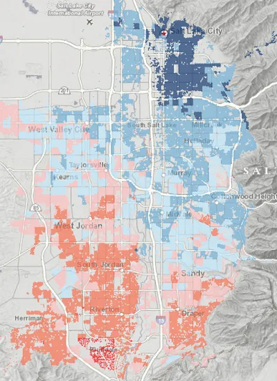
Display the percentage of votes
If we’re trying to get a feel for the political landscape, then It’s essential to see how the election was won. Displaying the winner is fundamental, but adding the percentage of win enriches the story. A close win tells a different story than that of a landslide. Presenting this information on the map helps paint a more telling story of our community.
Displaying quantitative spatial data is where GIS shines. There are a variety of methods available, but the basic concept is to symbolize the results using a color gradient. In our case, darker colors intuitively represent areas where a larger percentage went to the winning candidate. As shown in Figure 2, the percentage of votes adds a new dimension to the map and it gives the viewer another aspect to explore.
You instantly notice that the Salt Lake Valley is polarized. But, with the addition of graduated colors, you also see that this polarization strengthens the further north or south you go. The downtown and university areas are in stark contrast to the newer, suburban neighborhoods in the south end of the valley.
Figure 2: Symbolizing the Winning Margin
It’s no coincidence that maps have been used in elections for more than a century, opens in a new tab. They’re the best medium for this type of data. However, as we’ve seen, maps can be misleading. Election geographies, such as voting precincts and counties, are not designed to represent the distribution of voters.
This post has shown how using a few simple GIS techniques can yield a clearer picture of the election. These techniques not only aid in telling a compelling story, but they also give us a better understanding of the political landscape and our local communities.
I encourage you to apply these techniques when mapping other population-based data such as demographic, economic, or housing data.
Let’s continue the conversation on Twitter, opens in a new tab or email.
Methodology
- SGID Address Points, opens in a new tab were used as a proxy for voter residences in Salt Lake County. Non-residential addresses were removed.
- The 100-meter hexagons (polygons) were created from the address points using Optimized Hot Spot Analysis, opens in a new tab.
- Hexagons containing only one address were removed from the map.
- Election results were downloaded from Salt Lake County Clerk’s Office, opens in a new tab.
- The election results were joined to the SGID Voting Precincts, opens in a new tab, using the precinctid field.
- The voting precincts (now containing the election results) were then spatially joined to the 100-meter hexagons using Intersect.
- The results were then symbolized based on the percentage of votes the winning candidate had of the total, using Graduated Colors, opens in a new tab, with Manual Breaks, limited to 3 Classes.