Having worked with UGRC for the past three years, I’ve started to notice that GIS is involved in just about everything. That’s why I’ve found it so interesting to see how GIS is “having a moment,” so to speak, during this coronavirus pandemic. The field of GIS, which is already involved in so many aspects of our daily lives, even if it’s normally behind the scenes, is in the spotlight now more than ever. Take the Johns Hopkins Coronavirus Resource Center world map, opens in a new tab for instance. The COVID-19 Map FAQs page, opens in a new tab states that, “Feature requests per day on the dashboard have grown from about 200 million in late January to 1.2 billion daily requests in early March. A ‘feature request’ represents the number of times visitors have accessed the underlying data while visiting the dashboard.” That’s an astounding increase! But why is this resource, and others like it, so helpful to people right now? Why are people turning to maps to make sense of what’s happening in the world?
These questions led me down a rabbit hole of research into the relationship between GIS and public health, and I found a few answers about why GIS may be so important in light of the coronavirus.
1. Historically, GIS has a solid track record for helping us understand public health situations
As Greg Bunce discusses in his “Digital Maps - How Chance, Timing, and Heritage Shaped Modern GIS” article, GIS really made its debut in connection to health when it helped resolve the London cholera epidemic of 1854. John Snow, a British physician, analyzed the relationship between water pumps and cholera cases, and he realized that water was the culprit in the spread of the disease. He made a spatial connection between the pumps and the disease, and that made all the difference in preventing further spread. Even from this early case study, “Mapping was an approach employed both by the officials charged with responding to this or that disease incursion and the medical personnel who struggled to treat those afflicted… . Then as well as now, mapping served and serves the science of its day” (Koch 2005, 2).
Since then, GIS has had an impact on several other health situations:
- In 1890, Theobald A. Palm “used maps to delineate the geographical distribution of rickets” (Waller and Gotway 2004, 2, opens in a new tab).
- In 1948 and 1956, H.F. Blum and H.O. Lancaster, respectively, used spatial analysis to study the relationship between sunlight and cancer (Waller and Gotway 2004, 272, opens in a new tab).
- In 2006, the National Cancer Institute published Geographic Information Systems (GIS) and Cancer Research, opens in a new tab, a publication outlining several applications of GIS in relation to cancer cases. (The institute also now has a whole site, opens in a new tab dedicated to GIS resources related to cancer.)
- In 2017, GIS played a role in a study about the Ebola virus (B.L. Gleason et al. 2017, opens in a new tab).
- (And many other cases.)
As evidenced by these situations, GIS has been successful in providing a deeper understanding of public health issues. With that successful history, it’s no wonder that people are turning to GIS for answers about the coronavirus. GIS has helped in the past, so maybe it can help again.
2. GIS helps people navigate through complicated layers of information
GIS, by its very nature, helps people make sense of complicated information. With a quick glance at the UGRC SGID page, you can see how many subjects GIS can shed light on: bison habitat, weather stations throughout Utah, the locations of heliport landing facilities, and a seemingly endless number of other diverse topics. GIS presents this information in a unique way, and it can also provide information on the relationship between those different layers of information.
Going back to the Johns Hopkins’ map, opens in a new tab as an example: on the site’s Maps & Trends page, opens in a new tab of the Critical Trends tab, it has a whole list of questions that GIS can help answer.
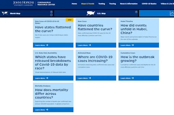
To answer these questions, you have to make connections between several layers of data. For instance, to answer the question of “Where are COVID-19 cases increasing?” you’d need to consider information such as the geographic boundaries for each country, the population of each country, the number of cases in the country, and the number of cases in previous weeks in the country. And then you’d need to compare all that information with data from another country, and another country, and another to really get a bigger-picture view of where cases are increasing. If you were to verbally write out this information, it may take several paragraphs to talk about the trends in different countries, especially depending on how many countries you were comparing.
But GIS can help us draw connections between each of these complicated layers and help us understand the overall trends of COVID-19 data. In order for information about case numbers, demographics, causes, or any other aspect of the virus to really make sense, you have to know about the geographical component. What are the case numbers for a certain area? Who in a defined area is being affected? Where did the virus originate? And so on. Without that geographical anchor point for coronavirus information, the information doesn’t have the context it needs in order to truly be meaningful and helpful.
To answer the question of “Where are COVID-19 cases increasing?” Johns Hopkins Coronavirus Resource Center has an animated map, opens in a new tab that color-codes the population for each country for each week, and the countries visually change colors to show you the trends. In a few seconds, the map is able to provide you the same information that it would otherwise take paragraphs to describe. And instead of just answering the question of “Where are COVID-19 cases increasing?” with perhaps a list of countries with their case numbers, the map answers the larger question of “How has the number of cases of COVID-19 changed globally over time?” And that’s the beauty of GIS.
3. GIS naturally involves intergroup collaboration, which is essential for coronavirus response
Collaboration between groups is an essential part of the GIS field, and that’s another reason why GIS could be so important in relation to the coronavirus. Let’s go back to the “Where are COVID-19 cases increasing?” question and apply it on a local Utah level. To answer this question, you might first want to examine Utah counties, and to find out the geographic boundaries of each county, you’d need to work with the state’s county recorders. To learn about the population for each county, you’d be relying on the US Census Bureau. To learn about the number of cases of coronavirus in a county, you might look to the county health department. And so on. And then in Utah, UGRC would be the keeper of all this data, so we’d work with contacts from all of those groups.
You can begin to see how many different groups are involved in collecting and making sense of GIS data. GIS, in general, is only as good as its data, and data is only as good as the collaboration between various entities to get that data.
Agendra Kumar, Esri India president, describes this collaborative atmosphere well saying, “With location as a common denominator, Geographic Information System (GIS) technology provides the capability to enable this common operating picture for multi-agency collaboration” (Singh 2020, opens in a new tab). Later in the interview, he also goes on to describe how Esri, a world leader in GIS, is collaborating with various agencies about the coronavirus.
Esri is working with various government agencies around the world and bodies such as World Health Organization (WHO) and Centres for Disease Control & Prevention (CDCP) to help them leverage GIS technology to make decisions, plan and communicate various measures to control the spread of pandemic. (Singh 2020, opens in a new tab)
In order for any country to effectively respond to the coronavirus, it is essential that various local and national groups work together to share information, assess that information, and take action on that information. GIS naturally opens the door for this collaboration.
The Coronavirus and Our Spatial Brains
Now, all those reasons are valid and important in discussing how and why GIS is so essential during this pandemic. But I also have to wonder though about one more potential reason that we’re so interested in GIS, especially during times of uncertainty: Is spatial information about the coronavirus particularly helpful because our brains are naturally wired to process information spatially and visually? Maybe we’re turning to GIS right now because processing information in that way naturally makes sense to our brains, and when things are uncertain and unpredictable in the world, like they are right now, we turn toward things that are familiar in order to gain a sense of comfort and control.
As stated in the UGRC article “Cognitive Maps - The Science Behind our Brain’s Internal Mapping and Navigation System,” “[The] brain is a spatial organ” (Bunce 2020). When we have a sense of “where” in a situation, we’re better able to process and retain information. Geographical insight allows people to understand what’s going on around them in a different way, and a large part (albeit not the whole part or the most important part necessarily) of gaining that geographical insight is visual.
People are more likely to notice and pay attention to visual information than written information (which I find especially ironic as I write this article). Jon Puleston, Kantar Consulting, explains this phenomenon well in the article “The Science of Visuals”, opens in a new tab: “The human brain thinks in pictures.” And what are maps but pictures that share information about a specific area?
Looking at a map is a visual experience—you see landmarks, names of different areas, different colors representing something on the map, etc. Gaining spatial awareness in a physical space is also visual; we often look to landmarks to understand where we are. Puleston continues, “We are more likely to take notice of visual information than text based facts because our brains derive meaning from it more efficiently.”
As Puleston describes, we process information visually and spatially because it’s easier and more efficient for our brains. And since GIS is heavily reliant on visual and spatial information, it makes sense that we’re turning to GIS to make sense of the coronavirus. People want to make sense of what’s happening right now. Psychologically and emotionally, people feel out of control, because, in large part, they are. GIS helps us visually connect the dots of each coronavirus case; it helps us better understand why and how this is happening and gives us some sense of control over, or at least some understanding of, the situation.
Going back to the question of “Where are COVID-19 cases increasing?”: when we visually see colors on a map changing over time, we’re able to recognize, “There’s a lot of red in this area.” or “This area has changed from red to yellow.” and so on. Instead of comparing numbers of cases, we can see what’s happening and where, and that information is processed by our brains in a different, more efficient, way than raw data.
In fact, as humans, we’ve been communicating through symbols since prehistoric times. Before humans started communicating information via written language, they were communicating through symbols and graphics (Frédéric Zalac and Kris Fleerackers 2015, opens in a new tab). GIS is a modern-day continuation, and expansion, of our innate human ability to communicate through symbols.
Wrapping Things Up
Whatever the reason for the current focus and reliance on GIS during this pandemic, I’m glad we have such a great resource to help us process information in a meaningful way. Hopefully GIS can continue to shed light on the current health situation and help us better prepare for whatever the pandemic holds moving forward.
Sources
Bunce, Greg. “Cognitive Maps - The Science Behind our Brain’s Internal Mapping and Navigation System.” UGRC Blog. Published January 30, 2020. https://gis.utah.gov/cognitive-maps/.
Bunce, Greg. “Digital Maps - How Chance, Timing, and Heritage Shaped Modern GIS.” UGRC Blog. Published September 3, 2019. Accessed May 14, 2020. https://gis.utah.gov/digital-maps-gis-history/.
Geographic Information Systems (GIS) and Cancer Research. US Department of Health and Human Services, National Institutes of Health, National Cancer Institute, 2006. (NIH Publication No. 07-6096). Reproduced by the US Department of Commerce National Technical Information Service. Springfield, VA. Accessed electronically on June 11, 2020. https://classic.ntis.gov/assets/pdf/st-on-cd/PB2007103350.pdf, opens in a new tab.
GIS Portal for Cancer Research website. National Cancer Institute. Last updated June 09, 2020. https://gis.cancer.gov/, opens in a new tab.
Gleason, B. L., S. Foster, G. E. Wilt, B. Miles, B. Lewis, K. Cauthen, M. King, et al. “Geospatial Analysis of Household Spread of Ebola Virus in a Quarantined Village - Sierra Leone, 2014.” Abstract. U.S. National Library of Medicine, October 2017. https://www.ncbi.nlm.nih.gov/pubmed/28826426, opens in a new tab.
Johns Hopkins University Communications. “COVID-19 Map FAQs.” Johns Hopkins Whiting School of Engineering, Center for Systems Science and Engineering. Last updated March 30, 2020. https://systems.jhu.edu/research/public-health/2019-ncov-map-faqs/, opens in a new tab.
Johns Hopkins University & Medicine, Coronavirus Resource Center. Maps & Trends, Animated Maps. “Cumulative cases over time” [electronic map]. Last updated on June 11, 2020. https://coronavirus.jhu.edu/data/animated-world-map, opens in a new tab.
Johns Hopkins University & Medicine, Coronavirus Resource Center. “COVID-19 Dashboard by the Center for Systems Science and Engineering (CSSE) at Johns Hopkins University (JHU)” [electronic map]. https://coronavirus.jhu.edu/map.html, opens in a new tab.
Koch, Tom. Cartographies of Disease: Maps, Mapping, and Medicine. Redlands, CA: ESRI Press, 2005. Accessed electronically on May 15, 2020, via https://esripress.esri.com/storage/esripress/images/321/cartofdisease_two_chap.pdf, opens in a new tab.
McCullough, Maggie. “Introducing PolicyMap COVID-19 Quick Maps.” PolicyMap.com. May 6, 2020. https://www.policymap.com/2020/05/policymap-covid19-quick-maps/, opens in a new tab.
Puleston, Jon. “The Science of Visuals.” Kantar Consulting. Accessed June 11, 2020. https://www.lightspeedresearch.com/science-visuals/, opens in a new tab.
Singh, Yashvendra. 2020. “How enterprises are using GIS to track Covid-19 impact.” ETCIO.com. Published March 26, 2020. Accessed May 18, 2020. https://cio.economictimes.indiatimes.com/news/strategy-and-management/how-enterprises-are-using-gis-to-track-covid-19-impact/74821102, opens in a new tab.
Waller, Lance A., and Carol A. Gotway. Applied Spatial Statistics for Public Health Data. Hoboken, NJ: John Wiley & Sons, 2004. Accessed electronically on May 14, 2020, via https://faculty.psau.edu.sa/filedownload/doc-12-pdf-7cc1c3f0a0831480b59a456b3fd2f711-original.pdf, opens in a new tab.
Zalac, Frédéric, and Kris Fleerackers. “Did early humans communicate with cave signs?” CBC News. Posted May 20, 2015. Last updated May 21, 2015. Accessed June 11, 2020. https://www.cbc.ca/news/technology/did-early-humans-communicate-with-cave-signs-1.3040723#:~:text=While%20cave%20paintings%20have%20long,humans%20before%20the%20written%20word, opens in a new tab.
General Reading/References
“Allocentric vs. Egocentric Spatial Processing.” Mental Imagery and Human-Computer Interaction Lab. Harvard Medical School Department of Radiology. Accessed June 11, 2020. https://www.nmr.mgh.harvard.edu/mkozhevnlab/?page_id=308, opens in a new tab. *The publications page here: https://www.nmr.mgh.harvard.edu/mkozhevnlab/?page_id=11, opens in a new tab has some great resources.
Cartographic Guidelines for Public Health. Centers for Disease Control and Prevention, Geography and Geospatial Science Working Group. Published August 2012. https://www.cdc.gov/dhdsp/maps/gisx/resources/cartographic_guidelines.pdf, opens in a new tab.
Cromley, Ellen K., and Sara L. McLafferty. GIS and Public Health. 2nd ed. New York, NY: The Guilford Press, Guilford Publications, 2012. https://www.guilford.com/books/GIS-and-Public-Health/Cromley-McLafferty/9781609187507, opens in a new tab.
Foster, Stephanie, Erica Adams, Ian Dunn, and Andrew Dent. “Geographic Information System Data.” The CDC Field Epidemiology Manual. Centers for Disease Control and Prevention. Last reviewed December 13, 2018. https://www.cdc.gov/eis/field-epi-manual/chapters/GIS-data.html#ref7, opens in a new tab.
Herweg Nora A., and Kahana Michael J. “Spatial Representations in the Human Brain.” Frontiers in Human Neuroscience 12 (2018). doi:10.1086/591611. https://www.frontiersin.org/article/10.3389/fnhum.2018.00297, opens in a new tab.
Robert B. Bechtel, and Arza Churchman. Handbook of Environmental Psychology. New York: John Wiley & Sons, Inc., 2002. Accessed electronically via https://books.google.com/books?id=G1F2nlg1pIAC&printsec=frontcover&source=gbs_ge_summary_r&cad=0#v=onepage&q&f=false, opens in a new tab.
Schenk, Frithjof Benjamin. “Mental Maps: The Cognitive Mapping of the Continent as an Object of Research of European History.” European History Online (EGO). Leibniz Institute of European History (IEG). Published July 08, 2013. https://www.ieg-ego.eu/schenkf-2013-en, opens in a new tab.
_[UGRC]: The Utah Geospatial Resource Center _[GIS]: Geographic information systems *[SGID]: State Geographic Information Database