When we analyze a GIS layer, we often want to use one of the attributes to group the features and see how other attributes differ amongst the groups. For many GISers, it’s second nature to do this visually by mapping a layer by unique values or graduated symbols based on numerical values.
However, at the end of the day, we’re not paid just to make pretty maps (except for a lucky few who are)—we’re called upon to answer questions using the attributes in our data: how do housing attributes vary across counties? What are the correlations between income, education, and location? How does land use type affect species diversity? The data supporting these answers can be shown with a map, a table, a chart, or even just a handful of numerical values.
To answer these questions, we have to mold, transform, and reshape our data tables. Pandas provides several tools for doing this, but knowing which one to use isn’t always immediately obvious.
Today we’ll use the Housing Unit Inventory, opens in a new tab (HUI) and Pandas’ unstack, pivot, and pivot_table methods to investigate how the type of housing units built (single-family, townhome, apartment, etc) has changed over time.
Data Has Body Types? Wide Versus Long
Before we can dive into these tools, we first need to cover some background theory on data shape. Neatly organized data tables can fall on a spectrum from “wide” to “long”, opens in a new tab.
Most GIS datasets are “wide” by nature. Each row in the table is an individual feature with attributes associated with it, and we almost never duplicate features to store different attributes. Duplicate features often make our eyes twitch involuntarily when we see them. There’s only one thing in real life that we’re modeling, so why are there multiple things in our model?
You can think of wide data as being focused on an individual subject or record with a bunch of columns storing different values or observations (hence this also being referred to as “record” format). Here’s an example municipality feature class with a handful of different attributes.
| Name | Pop2000 | Pop2010 | Pop2020 | Area | Class | SHAPE |
|---|---|---|---|---|---|---|
| City A | 2439 | 2785 | 3254 | 2.75 | Minor | <polygon> |
| City B | 125836 | 113957 | 153290 | 12.49 | County Seat | <polygon> |
In contrast, a long table has multiple rows for each subject, each row containing an observation or data point differentiated from others for that subject by a categorical value stored in one or more separate columns. This categorical value may be a timestamp, or it could be a broader grouping variable. This is also called “stacked” format because observations are stacked on top of each other.
You can think of long data as being focused on a single column that holds values, with a bunch of supporting columns to differentiate the values from one another. Let’s manually pivot our municipality table from before to long format. We’ll use a single value column and another column named “Attribute” to define the category of the value.
| Name | Attribute | Value |
|---|---|---|
| City A | Pop2000 | 2439 |
| City A | Pop2010 | 2785 |
| City A | Pop2020 | 3254 |
| City A | Area | 2.75 |
| City A | Class | Minor |
| City A | SHAPE | <polygon> |
| City B | Pop2000 | 125836 |
| City B | Pop2010 | 113957 |
| City B | Pop2020 | 153290 |
| City B | Area | 12.49 |
| City B | Class | County Seat |
| City B | SHAPE | <polygon> |
Hopefully some of the tradeoffs between the two forms are clear when looking at these two tables. It is difficult to add new types of observations to a wide table—doing so requires altering the schema. For example, when the 2030 census data are released, we’ll have to add a “Pop2030” field to our feature class, and if we want to remove older population values we’ll have to remove fields.
Long datasets solve this challenge by just requiring you to add a new row with a different categorical value. However, if your data are spatial, you end up duplicating the features. You may also be limited by the value type of your observation column. Pandas can handle a column of mixed ints, floats, and strings, but most database and GIS software expect a single data type per column.
Loading the Housing Unit Inventory Dataset
First, we’ll use the ArcGIS API for Python, opens in a new tab to load the ArcGIS Online copy of the HUI as a pandas dataframe. This is a large dataset with a lot of vertices, so it can take a couple minutes to load.
gis = arcgis.gis.GIS()
hui_item = gis.content.get("bbdc62867c2340949f530a71666223ab")
hui_feature_layer = hui_item.layers[0]
hui_dataframe = hui_feature_layer.query(return_geometry=False, as_df=True)
The HUI is a large dataset with polygon features for individual properties or groups of related properties (PUDs, townhomes, etc). It contains a couple categorical fields like unit type and subtype, city/county, and decade built. It also includes numerical data for each feature like unit count, acreage, and total assessed value.
Like many GIS datasets, it can be considered a wide dataset that also includes categorical fields that allow us to group records together and calculate aggregate statistics from the numerical data, like averages or sums across the groups.
Using groupby to Summarize by Categorical Fields
One way to investigate a dataset that has categorical “grouping” columns like this is to use Pandas’ groupby, opens in a new tab functionality. To figure out how the kind of housing built has changed over the years, we’ll sum the unit count in each subtype per decade:
hui_dataframe.groupby(["BLT_DECADE", "SUBTYPE"])["UNIT_COUNT"].sum()This gives us a hierarchically-indexed series that displays the unit counts broken down by decade and subtype. This series of unit counts will be the dataset we manipulate in the next parts of this post.
BLT_DECADE  SUBTYPE
1840        apartment                4.0
            single_family            2.0
1850        apartment                6.0
            single_family           21.0
1860        apartment               23.0
                                  ...
2020        mobile_home_park        21.0
            single_family        42714.0
            single_family_adu       10.0
            townhome             20175.0
            townhomes               15.0
However, if we try to plot the series out, the x-axis uses each unique combination from the MultiIndex and it just becomes a mess:
hui_dataframe.groupby(["BLT_DECADE", "SUBTYPE"])["UNIT_COUNT"].sum().plot(kind="bar", figsize=(10, 6))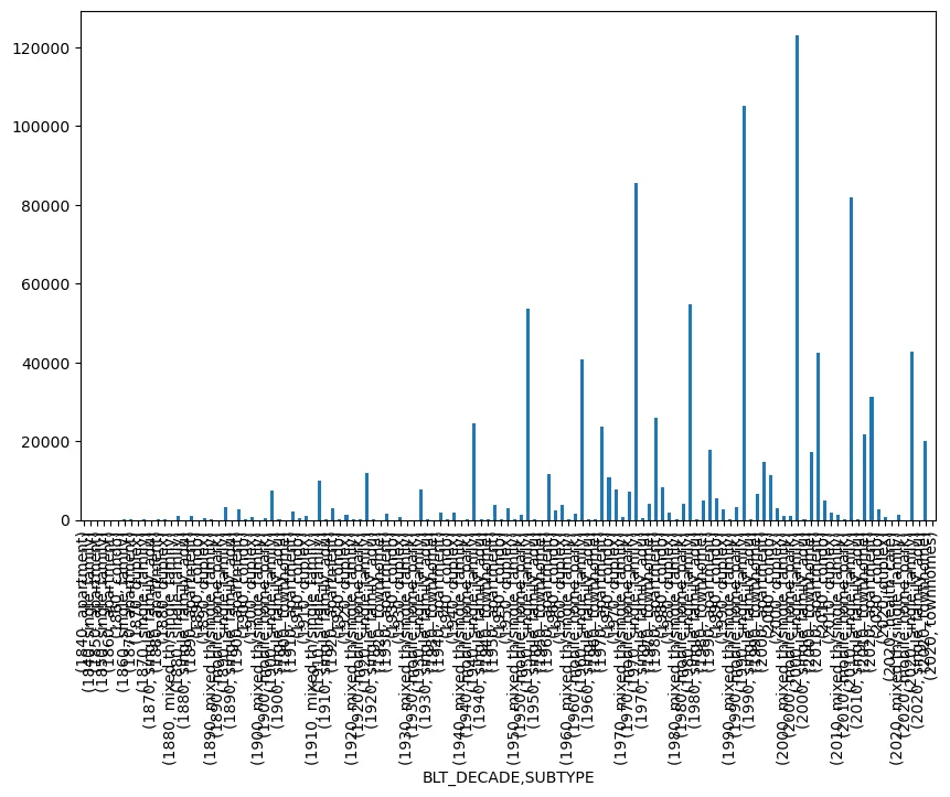
This is because our new series is itself a very long dataset. Each row has a single numerical value and two categorical values, which in this case are exposed through the MultiIndex rather than being individual columns themselves. We could probably mess around with matplotlib axes and get a good plot out of this, but there’s a simpler way.
Widening Through unstack
Because our series has a hierarchical MultiIndex, we can use Pandas’ ‘unstack’, opens in a new tab method to widen our data to something a little more useful.
unstack takes a long dataset that has a single observation per row and uses the categorical values in the innermost MultiIndex level to create new columns. Now, you have a proper two-dimensional wide dataframe whose index is the remaining index level(s), whose columns are the values of the innermost index level, and whose values are the observations put in their proper place according to the resulting matrix.
For example:
hui_dataframe.groupby(["BLT_DECADE", "SUBTYPE"])["UNIT_COUNT"].sum().unstack()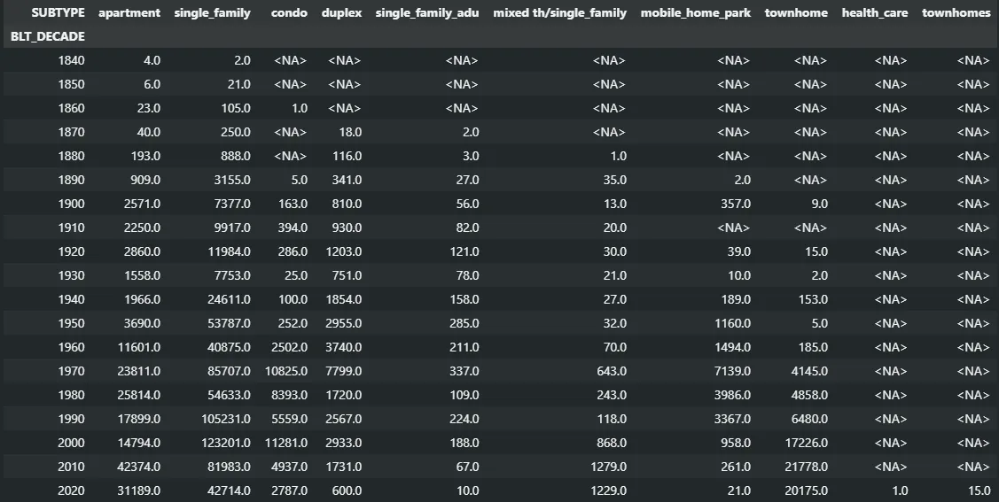
(Note that this is a great way to catch inconsistencies in your data, like the health_care and townhomes entries that snuck in the latest update. We’re working on fixing those.)
We can now plot this dataframe fairly easily. We’ll use a stacked bar chart this time to combine each type into a single bar for each decade:
hui_dataframe.groupby(["BLT_DECADE", "SUBTYPE"])["UNIT_COUNT"].sum()
             .unstack()
             .plot(kind="bar", stacked=True, figsize=(10, 6))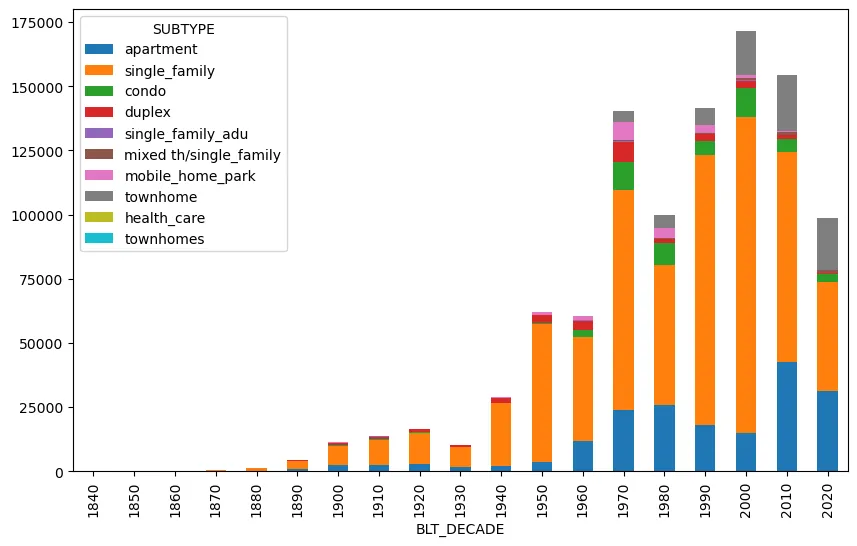
Now we have a much more understandable graph that makes it easier to pick out trends, like the overall housing slump in the 80s, the near disappearance of new mobile homes, and the relative decrease in new stand-alone single home construction in the last 15 years.
pivot: The General Case of Unstacking
Pandas’ pivot, opens in a new tab operation is the general case of unstack. Instead of using one of the levels of the index for your column values, you’ll use existing columns of a simple long dataframe without a meaningful index. The index and column parameters specify the columns whose categorical data will become your new index and column names, and the value parameter specifies the column containing the observations you want to put in the matrix.
We can create an appropriately-shaped dataframe from our hierarchically-indexed series by resetting its index, which drops both levels of the index (BLT_DECADE and SUBTYPE) into their own columns of categorical values. Now that we’ve got a proper long dataframe, we can pivot that to get the wide dataframe we want.
hui_dataframe.groupby(["BLT_DECADE", "SUBTYPE"])["UNIT_COUNT"].sum()
             .reset_index()
             .pivot(index="BLT_DECADE", columns="SUBTYPE", values="UNIT_COUNT")
Melt Me Down
We’ve been focused on going from long to wide, but Pandas also has tools for going from wide to long. It’s melt, opens in a new tab function allows you to automatically do the transformation I did by hand to the table at the beginning- choose a column (or columns) as ID variables and stack the rest of the value columns into two “variable” and “value” columns.
But Can It Do Pivot Tables?
Ask someone what makes them an Excel expert, and chances are you’ll hear “pivot tables” in their explanation. This combines the three steps we’ve done to the HUI data so far: grouping the data by categorical columns, performing some aggregation function on a numerical column, and pivoting the results into an easy-to-parse two-dimensional table.
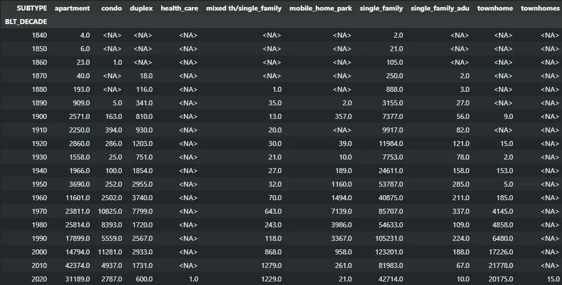
Because this specific case of pivoting is so prevalent, Pandas has its own built-in version of it. This single function replaces the groupby, sum, and pivot/unstack functions we’ve been chaining together.
pd.pivot_table(hui_dataframe, values="UNIT_COUNT", index="BLT_DECADE", columns="SUBTYPE", aggfunc="sum")This again gives us the table we’re familiar with by this point:
Coming Full Circle
So why didn’t we just lead with pivot_table? First, this is a more limited and specific case of pivoting for when you want to perform one of the common aggregator functions (Which functions are those? As usual, StackOverflow to the rescue, opens in a new tab! Basically, it’ll try anything you throw at it, but there are some common ones.).
pivot and unstack/stack will apply to other situations where an earlier analysis step gives you a hierarchically indexed data structure or creates columns with categorical group identifiers. It can also be useful to reshape the results of joins into the wide format expected by GIS software.
But more importantly to me, understanding what the unstack and pivot methods were doing helped me to really grasp how pivot_table works. My data exploration often begins with the thought “what happens if I group the data by this column?” and flows from there. If you’re always working with the same type of data, maybe you don’t have to go through that exploration phase and can go straight to pivot_table. But that’s one of the perks of working at UGRC: we’re often looking at very different datasets from one project to the next.
I hope you found this exploration into both theory and examples of some of the data reshaping tools available in Pandas useful. When you’re first learning Pandas, it can often feel like you’re missing one small—but vital—part of the puzzle that’s keeping you from the analysis you’re after. Now you’ve got the understanding and tools to wrangle your data and deliver stunning insights (ok, maybe at least just useful insights…).