Ninety-nine times out of a hundred, whenever you create a webmap you’re anxiously hoping people will use it. I remember watching the stats for my first real webmap, opens in a new tab, hoping I’d break a hundred views. 1,000 would be amazing. 10,000 was unthinkable.
But that other one-in-a-hundred map is so sobering you wish the numbers would stop climbing.
Seven months ago (April 2020), the Utah Department of Health approached us to create a map, opens in a new tab for the State’s coronavirus.utah.gov, opens in a new tab resource and information site.
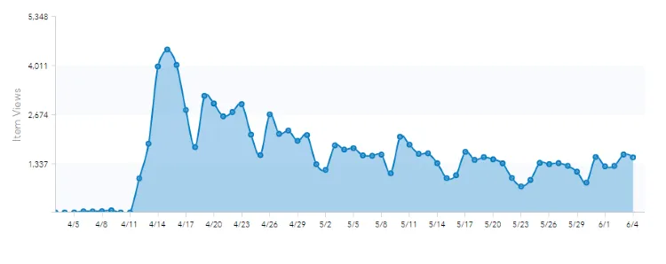
For the first few weeks of its existence, we watched in concern as the initial usage wave died down and it seemed like the map wasn’t being used. Normally, I’d be worrying about my work being appreciated, but this was a lot cartographically closer to a life-or-death subject than I’d ever come. We made this map to help Utah survive and recover, and if the map wasn’t being used it meant we weren’t fulfilling our duty to the people of Utah.
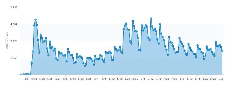
We saw a rise in usage over the summer as Utah experienced a surge in cases after Memorial Day. I began to feel like the map was living up to its promise. People were getting tested, and because of this testing they would know if they needed to take individual steps to stop the spread. We continued to add sites as new providers came online and make modifications to existing sites. Many sites shifted their hours towards the morning to avoid the summer heat.
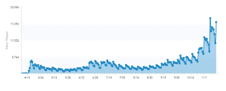
However, as fall progressed we faced the grim reality that we’re not out of the woods yet. The usage rose again alongside active cases. The last three weeks in particular have seen massive jumps. The summer usage bump that used to seem so significant almost disappears now as the usage climbs ever upward. The largest single day swing came after the Governor announced new plans to try to stop the spread on November 6th.
As I’ve watched this, I’ve been painfully aware that our usage graph is just a proxy variable for active cases, hospitalizations, and, ultimately, deaths. It’s a proxy for overworked nurses and doctors, concerned parents, and grieving family and friends.
How I wish I didn’t have to make this map.
Through this unwanted adventure, we’ve learned valuable lessons about the role of personal relationships in collecting accurate data and the technological resources available to us.
Relationships: The Power of People
As map geeks, we tend to focus on the latest and greatest tech. However, we’ve also come to appreciate that the relationships we have with people in departments, municipalities, and companies across the state are even more crucial. The map would not be possible without these relationships.
Internal Relationships
The Department of Health turned to us for this map because we’ve established a good relationship with them on past projects. When it came time to build something quickly, everyone already knew what to expect from each other even though we were all working remotely. That relationship has solidified as we’ve worked together on this map.
Because the Department of Technology Services, our parent department, was the one creating the main website, we just had to jump on a few video chats with them to work out how best to link the website and webmap technologies. Our existing relationships lowered the interpersonal barriers and let everyone just focus on the job at hand.
Since launching the map, we’ve worked with the Dept. of Health to update both the underlying data and the structure of the map itself. We work in tandem to get data from providers and update it on the website, aided by a shared tracking spreadsheet. When we spun up a Spanish version of the map, they already had someone to help with translating everything, and this relationship has continued as each site’s instructions are translated as needed. This relationship allows us to respond to requests quickly and efficiently.
External Relationships
Perhaps the most critical relationships we’ve witnessed have been between the Dept. of Health and the individual healthcare providers, especially in rural areas. We’ve gotten just a glimpse of how these relationships, built over years of visits, calls, and emails, have smoothed the process of getting information to and from providers who may not have the resources of a large hospital network. These bonds not always built easily but are vital to the map’s statewide accuracy.
Then there are our relationships with larger, broader organizations. We’ve worked with Twenty Labs, the contractors who built the HealthyTogether app for the State and other institutions, to ensure data flows from our map to theirs easily. One of the challenges we’ve faced is sharing our data with larger outside groups, like GISCorps or Google, while still keeping it in a format internally that serves the needs of our primary users. This is still a work in progress.
Resources: ArcGIS Online
We created the map and its underlying dataset quickly and have seen a massive increase in their usage since. The cloud-based ArcGIS Online infrastructure and tools allowed us to create them quickly and scale them easily and effortlessly. We didn’t have to write any custom code or handle any storage, performance, or network issues, even though they have become some of our most-used resources. This is the same infrastructure behind Johns Hopkins’ COVID dashboard that has been a key part of our collective understanding of the pandemic.
Web AppBuilder
We built the map (or technically the application) using ArcGIS Online’s Web AppBuilder. This WYSIWYG editor allowed us to configure a handful of widgets to get the needed functionality. It is embedded in the main site via an <iframe> to provided a (mostly) seamless integration with the rest of the site. It is functional on mobile devices, though not quite optimized for their smaller screens.
Hosted Feature Services
For our data source, opens in a new tab, we started with a copy of the nation-wide, volunteer-driven dataset being created by GISCorps, opens in a new tab. We created our own copy, instead of updating the existing dataset directly, to allow us to manage the schema according to our needs and have more direct control over what sites are shown.
Because our data source is a hosted feature layer, opens in a new tab in ArcGIS Online, we can use a single, unified dataset for multiple purposes. We have a private view for editing that allows either us or the Dept. of Health to update the data or add new sites. We also have the public version (linked at the beginning of this section) used by the map and publicly available to anyone else who wants it. We don’t have to worry about changes propagating through different copies.
As a feature service, our data set can also be accessed programmatically via its REST, opens in a new tab endpoint. This enabled Twenty Labs to scrape our data on a regular interval for their app, and has also allowed the coronavirus.utah.gov website folks from the Dept. of Technology Services to create a list-based view, opens in a new tab of the testing site data. They were able to put this interactive app together in just a few days because they can call the REST API directly with a simple HTTP request. They didn’t have to learn any new frameworks, and they don’t have to worry about maintaining their own version of the data.
Scaling
ArcGIS Online has scaled seamlessly as our usage has taken off. Despite being relatively simple and only being seven months old, our dataset already has more requests in the last 12 months than any of our other ArcGIS Online-hosted datasets. The map has nearly 800,000 hits and is now averaging 10,000+ new hits a day. Thanks to ArcGIS Online, we don’t have to worry about monitoring server performance or bandwidth usage.
In short, we’ve been able to combine our existing relationships with other agencies with the flexible and scalable ArcGIS Online infrastructure to make an accurate and responsive map despite ever-increasing demand.
I look forward to the day we don’t need it anymore.